
ASPE ISSUE BRIEF
Steven Sheingold, Nguyen Nguyen, and Andre Chappel
Disclaimer
Persons with disabilities having problems accessing this document may call (202) 690-6870 for assistance.
A central feature of the Affordable Care Act is the establishment of Health Insurance Marketplaces. The Marketplaces offer consumers organized platforms to shop for health insurance coverage, apply for financial assistance, and purchase coverage without any medical underwriting or premium adjustment based on pre-existing conditions. A key objective of the Marketplaces is to foster competitive environments in which consumers can choose from a number of affordable and high quality health plans. In this issue brief, we offer a progress report on the evolution of the competitive dynamics of the Marketplaces.
Prior studies found that the Marketplaces offered a variety of affordable plans in 2014.1 In addition, Marketplaces with a greater number of plans demonstrated significantly enhanced consumer choice and lower premiums.2 Below, we examine states that used the federal HealthCare.gov platform3 in both 2014 and 2015 and provide a detailed analysis of how the supply of issuers changed from 2014 to 2015, the level of competition achieved in 2015, and how changes in the supply of issuers affected premium growth between 2014 and 2015.
Key Findings
- Competition increased in most areas between 2014 and 2015:
- 86% of QHP-eligible individuals had access to at least 3 issuers in 2015, up from 70% in 2014
- On average, there was a net gain of one issuer per county
- Nearly 60% of counties experienced a net gain of at least 1 issuer, while only 8% of counties experienced a net loss of issuers
- Premium growth rates between 2014 and 2015 were low overall:
- The average growth rate in the second lowest silver (SLS) premium was 2%, weighting by 2014 enrollment
- A number of areas actually experienced decreases in premiums
- Competition among issuers had a significant impact on premium growth:
- Growth in the SLS premium between 2014 and 2015 was 8.4 percentage points lower in counties that experienced a net gain in issuers than in other counties
- Each net gain of one issuer was associated with a 2.8 percentage point reduction in the rate of SLS premium growth
- Growth in the average silver premium was 1.5 percentage points lower in counties that experienced a net gain in issuers than in other counties
The Evolving Landscape of Issuers and Plans: 2014-2015
We begin by examining the number of issuers in 2014 and 2015 by county. Because detailed county level information for State-based Marketplace plans is not yet available, the analyses are limited to the 35 states using HealthCare.gov in both 2014 and 2015 for selecting plans. As displayed on Table 1, the average number of issuers by county increased between 2014 and 2015. Growth in the number of issuers meant greater choice for shoppers in the Marketplaces in 2015.
As displayed in the left hand columns of the Table, the average number of issuers across counties increased from 2.6 to 3.5 – a gain of nearly one issuer per county. More than half of counties (59%) had a greater number of issuers in 2015; only 8% of counties had fewer issuers. The right hand columns present the same information but weights the averages by enrollment in the Marketplaces in each county in 2014. Using a weighted average takes into account where most enrollees reside and gives these counties greater emphasis. The weighted averages are much higher than the unweighted: specifically, in 2015 across all counties the weighted average number of issuers is 5.8, an increase of 1.4 issuers per county over 2014, meaning that markets with higher enrollment in 2014 attracted more issuers in 2015.
| # of counties | % of counties | 2014 un-weighted | 2015 un-weighted | % change un-weighted | 2014 weighted* | 2015 weighted* | % change weighted* | |
|---|---|---|---|---|---|---|---|---|
| Source: Marketplace Plan Landscape Files, 2014-2015; MIDAS Plan Selections 2014-15; and other filesThe data are restricted to the 35 states in the Federally Facilitated Marketplace * weighted by Marketplace enrollment 2014 | ||||||||
| All | 2,544 | 100% | 2.6 | 3.5 | 32% | 4.4 | 5.8 | 5.833% |
| Gained issuers | 1,489 | 59% | 2.7 | 4.3 | 58% | 4.3 | 6.2 | 44% |
| Lost issuers | 208 | 8% | 2.6 | 1.6 | -38% | 3.7 | 2.7 | -27% |
| Unchanged | 847 | 33% | 2.5 | 2.5 | 0% | 4.9 | 4.9 | 0% |
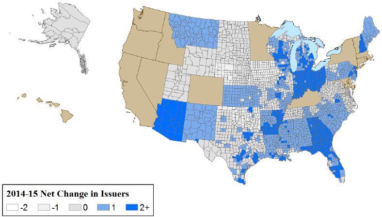
Figure 1 displays the geographic distribution of counties based on the net change in available issuers between 2014 and 2015. The change ranges from a loss of 2 issuers to a gain of 4 issuers.
Figure 1 – Many counties experienced net increases in issuers
One appropriate long run metric for success of the Marketplaces is whether they are able to achieve and maintain the appropriate number of issuers to sustain the vigorous competition envisioned under Affordable Care Act. That is, Marketplaces have a sufficient number of participants to assure that affordable, high quality products are being offered on a continuous basis. Previous research across a variety of product markets suggests that price competition typically intensifies with three or more competitors in a market.4 Of course, the exact number of competitors required to ensure robust competition may vary depending on the product and other unique market factors that may vary by locality. However, the evidence we observe on the relationship between premiums and the number of carriers in a market is consistent with the conclusion from the broader literature. We find that in counties with 3 or more issuers, 2015 benchmark premiums are more than 9% lower than in those with 1 or 2 issuers present.
This evidence also suggests that a useful metric of Marketplace competition is the share of individuals with access to plans from at least three issuers and its impact on choice. In 2014, 70% of individuals that were eligible to enroll in qualified health plans (QHP eligibles) in the Marketplaces had access to three or more issuers. In 2015, 86% of potential enrollees had a choice among 3 or more issuers and 64% had a choice among three or more plan types including health maintenance organizations (HMOs), preferred provider organizations (PPOs), point of service plans (POSs), and exclusive provider organizations (EPOs). This degree of choice is greater than consumers would typically have access to through employer-sponsored insurance. For example, information from the Kaiser Family Foundation/Health Research and Education Trust indicates that 85% of all employers and 56% of large employers (200 or more workers) offer only one type of health plan, and only 9% of large employers offer three or more plan types.5
What Factors were Associated with Net Change in Issuers
Table 2 provides a comparison of key characteristics between counties that experienced net gains and losses in the number of issuers. Overall, a relatively small percentage (14-17%) of commercial issuers doing business across all insurance markets within a rating area participated in the Marketplaces. Counties with more issuers6 that sold to other market segments (e.g., employer-sponsored insurance, Medicaid, Medicare) in 2014 were more likely to gain Marketplace issuers in 2015; presumably, because their costs of entering the Marketplaces were lower than for other carriers. The size of the rating area in which the county is located is also associated with different patterns of gains and losses in issuers. Areas that lost issuers were, on average, twice the size in square miles than those that gained issuers.7 Finally, areas where the individual market for health insurance prior to 2014 was much more concentrated were more prone to lose issuers.8
| Marketplace Variables | Average in Counties with Net Increasesin # of Issuers | Average in Counties with Net Decreases in # of Issuers |
|---|---|---|
| Source: Marketplace Plan Landscape Files, 2014-2015; MIDAS Plan Selections 2014-15; and other filesThe data are restricted to the 35 states in the Federally Facilitated Marketplace * weighted by Marketplace enrollment 2014 | ||
| Number of issuers in 2014 (unweighted) | 2.72 | 2.63 |
| Number of issuers in 2014 (weighted by Marketplace enrollment)* | 4.28 | 3.67 |
| 2014 second lowest cost silver plan 21y/o premium (unweighted) | 225 | 197 |
| Change in second lowest cost silver plan premium between 2014 and 2015 (unweighted) | -2% | 12% |
| 2014 second lowest cost silver plan 21y/o premium (weighted by Marketplace enrollment)* | 210 | 192 |
| Change in second lowest cost silver plan premium between 2014 and 2015 (weighted by Marketplace enrollment)* | 1% | 4% |
| On- and off-Marketplace individual insurance market concentration (state level HHI weighted by Marketplace enrollment) in 2013* | 3,799 | 5,281 |
| Size of rating area (sq. miles) | 12,856 | 19,609 |
| Ratio of the number of Marketplace issuers in the county to the total number of commercial issuers (individual and other markets) in the rating area in 2014 | 14% | 17% |
The Impact of Net Change in Issuers on Premium Growth 2014-2015
We focus on SLS premiums because they represent the benchmark for the allocation of advance payment of tax credits (APTCs) and because enrollment patterns to date indicate many consumers gravitate toward low-cost plans. We also examine growth in the average silver plan premium as an alternative measure, although this measure may be less relevant to consumers given the enrollment patterns described above. The analyses in this brief are conducted at the county level and are based on premiums priced for a 21 year old individual.
Overall, growth in SLS plan premiums was low between these two years at approximately 2% on average.9 An important question for assessing the evolution of the Marketplaces is whether increases in the number of issuers played an important role in moderating premium increases. In theory, as more issuers enter a market, competition is expected to intensify and thereby reduce premium growth. A net increase in issuers for any market might reduce premium growth, in part, because new issuers may offer plans at lower premiums than those of existing issuers, and by influencing incumbents to moderate their premium increases in order to maintain market share.
In this section, we examine these propositions for both the SLS premium and the average premium for all silver plans. In the first set of analyses, we examine the 2015 silver premiums offered by new entrants and the 2014 silver premiums offered by issuers that exited the market for 2015. We then consider to what extent these premiums potentially affected the 2015 benchmark premium (the second lowest cost silver plan premium). In the second set of analyses, we use statistical models to test at the county level the extent to which premium growth is associated with a net change in issuers from 2014 to 2015, after controlling for other factors that may also affect premium growth. First, we examine whether net increases in issuers at the county level changed the benchmark premium at the county level. Second, we examine and quantify the impact that a net change in the number of issuers (both increases and decreases) has on premiums.
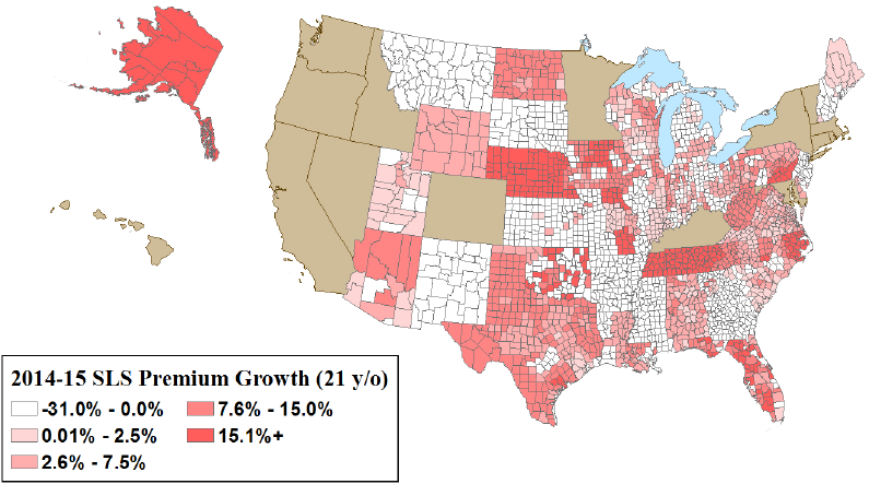
Figure 2 displays the county level change in benchmark premiums from 2014 to 2015. There was a significant range of premium changes that did not follow a particular geographic pattern. However, substantial differences in the growth rates occurred between counties that gained issuers and those that experienced a net loss (Table 2). Counties that had a net gain in issuers experienced a slight decline in benchmark premiums on average, while counties that had net losses had a 12% increase.
One way new issuers can gain market share is to undercut prevailing premiums. To examine whether by doing so, new entrants directly changed the benchmark premium at the county level, we compared their silver plan premiums to those offered by incumbent issuers (those present in both 2014 and 2015). In 42% of counties with new issuers, the new entrants offered at least one silver plan premium below what would have been the SLS for only the existing issuers, thereby directly reducing the SLS (data not shown in table).10 We also investigated the impact of exiting issuers on the benchmark premium. Of the exiting issuers, 17% offered a 2014 plan at or below the SLS plan premium (data not shown in table). Thus, their exit mostly did not affect the 2015 benchmark premium.
Figure 2. Most counties experienced low to negative growth in second lowest cost silver plan premiums
We also examined the impact of a net change in issuers on the benchmark premium after adjusting for other factors that may have influenced the change.11 First, we analyzed the impact of a net gain in issuers from 2014 to 2015 relative to experiencing a net loss of issuers or having no change in the number of issuers. As displayed in Table 3 (see Table A1 in Appendix for complete models), counties with a net gain in issuers were associated with adjusted premium growth rates 8.4 percentage points lower compared to those counties that either had no growth in the number of issuers or experienced a decline. In a similar manner, we estimated the adjusted impact on premium growth of each additional issuer at the county level. A net gain of one issuer was associated with a 2.8 percentage point reduction in benchmark premium growth.
In addition to estimating the impact of the number of issuers on the benchmark premiums, we used the same models to examine the impact on average silver premiums in the county. These effects were smaller than those estimated for the benchmark premium. We found that a net gain in issuers was associated with average adjusted premium growth rates that were 1.5 percentage points lower than in counties without any growth in issuers. In a similar manner, we estimated the adjusted impact on premium growth of a net gain in issuers at the county level. A net gain of one issuer has minimal to no impact on the average silver premium growth. Past research has shown that an increase in issuers results in greater variation of plans offered, with both higher and lower premiums.12 Therefore, the average premium may not change to the same extent as a particular point in the distribution, such as the SLS premium, in response to an issuer increase.
| Silver Plan Premium Growth Rate | ||
|---|---|---|
| Benchmark Premium | Average Silver Premium | |
| Key County Variables | Estimate (Pr>|t|) | Estimate (Pr>|t|) |
| Sources: Marketplace Plan Landscape Files, 2014-2015; MIDAS Plan Selections 2014-15;and other files The data are restricted to the 35 states in the Federally Facilitated Marketplace | ||
| Indicator for an increase in the number of issuers | -0.084 (0.000) | -0.015 (0.001) |
| Change in the number of issuers at the county | -0.028 (0.000) | 0.006 (0.001) |
Conclusion
The Marketplaces were established to provide consumers with a transparent, competitive place to shop for health insurance plans. The structure of the Marketplaces and insurance market reforms were designed to encourage competition among issuers. In 2014, the first year of coverage in the Marketplaces, most consumers had a large number of choices and areas with more competition experienced lower premiums, all other factors equal. The result of expanding issuer participation in 2015 was lower premium increases, which in turn, benefited consumers and public budgets.
Our analysis of issuer participation and premiums in 2014-2015 suggests that insurance market competition continued to expand in most places.
Technical Appendix A
The primary data sources used in the above analyses are plan landscape data for 35 states that used the HealthCare.gov platform in 2014 and 2015. These states included Alaska, Alabama, Arkansas, Arizona, Delaware, Florida, Georgia, Iowa, Illinois, Indiana, Kansas, Louisiana, Maine, Michigan, Missouri, Mississippi, Montana, North Carolina, North Dakota, Nebraska, New Hampshire, New Jersey, New Mexico, Ohio, Oklahoma, Pennsylvania, South Carolina, South Dakota, Tennessee, Texas, Utah, Virginia, Wisconsin, West Virginia, and Wyoming. Supplemental data on market characteristics were derived from the Area Resource File, the Dartmouth Atlas, the American Hospital Association hospital data, the Kaiser Foundation various databases, the RWJF County health Rankings, InterStudy commercial carrier count data.
For the purpose of this analysis, we consider "QHP eligible" any nonelderly, legally present individual who is uninsured or has non-group coverage and has a family income of: (a) above 138% FPL for adults in Medicaid expansion states or at least 100% FPL for adults in non-expansion states or (b) above 250% for children in any state. Our QHP eligibility definition is not the same as actual eligibility for coverage in the Marketplaces, and is an attempt to identify who is most likely to have or shop for coverage in the Marketplaces. Our estimates were based on the 2011 American Community Survey Public-Use Microdata Sample (ACS PUMS). One limitation of our estimates of the QHP eligible population by county is that the smallest geographic unit available in the annual ACS PUMS is the Census-defined public-use microdata area (PUMA). Many PUMAs comprise multiple counties, and counties are not identified in the ACS PUMS. For county analysis, we assigned PUMA populations to counties based on the distribution of the population according to a PUMA-county data crosswalk from the Missouri Census Data Center. For individuals who reside in a PUMA spanning multiple counties, we adjusted the ACS PUMS survey weights to assign those individuals all to the relevant counties. This method implicitly assumes that the geographic distribution of the uninsured is proportional to the distribution of the overall population; in reality, however, the uninsured are not likely to be spread uniformly throughout a PUMA. Another limitation is that the ACS produces an overestimate of the number of people with non-group health insurance coverage relative to other data sources, including the Current Population Survey (CPS) and the National Health Interview Survey (NHIS), and with administrative records. Because of over-reporting of non-group coverage in the ACS, our estimate of the number of likely consumers in the Marketplaces may be higher than the actual number. We use ACS data, because these data include sub-state geographic identifiers.
The data in Tables 1 to 2 include both unweighted and weighted county average. In the weighted analyses, county averages are weighted by 2014 enrollment in the Marketplaces. The regression analyses presented in Table 3 are not weighted by enrollment; rather we include the take up rate on the right-hand side of the regression equation. Our models estimate the impact of having a net increase in the number of issuers, as well as the incremental effect associated with having one additional issuer enter the market on the change in premiums. Premiums were defined as the second lowest cost silver plan premium available in the county, as well as each county’s average silver premium.
| Silver Plan Premium Growth Rate | ||||
|---|---|---|---|---|
| Benchmark Premium | Average Silver Premium | |||
| Key County Variables | Estimate Pr>|t| | Estimate Pr>|t| | Estimate Pr>|t| | Estimate Pr>|t| |
| Sources: Marketplace Plan Landscape Files, 2014-2015; MIDAS Plan Selections 2014-15; and other filesThe data are restricted to the 35 states in the Federally Facilitated MarketplaceSilver | ||||
| Indicator for an increase in the number of issuers | -0.084 0.000 | -0.015 0.001 | ||
| Change in the number of issuers at the county | -0.028 0.000 | 0.006 0.001 | ||
| CMS hospital wage index in 2015 | 0.192 0.000 | 0.236 0.000 | 0.112 0.000 | 0.125 0.000 |
| Inpatient days per capita in 2011 | -0.002 0.426 | -0.003 0.103 | -0.007 0.000 | -0.008 0.000 |
| Size of rating area (in 10,0000 sq. miles) | -0.003 0.000 | -0.002 0.000 | -0.001 0.035 | 0.000 0.636 |
| Percent of the population in rural area in 2014 | -0.003 0.723 | -0.006 0.428 | -0.005 0.477 | -0.005 0.493 |
| Hospital concentration (CBSA/county HHI, decimals) in 2013 | 0.015 0.040 | 0.016 0.034 | 0.008 0.255 | 0.011 0.127 |
| On- and off-Marketplace individual insurance market concentration (state level HHI weighted by Marketplace enrollment) in 2013 | 0.006 0.609 | 0.007 0.570 | 0.009 0.437 | 0.022 0.064 |
| Presence of a CO-OP plan in the county | -0.078 0.000 | -0.087 0.000 | -0.077 0.000 | -0.086 0.000 |
| Percent of QHP issuers that also issue Medicaid plans | 0.025 0.000 | 0.018 0.016 | -0.018 0.007 | -0.028 0.000 |
| Percent of QHP issuers new to individual market in state | 0.265 0.000 | 0.281 0.000 | 0.271 0.000 | 0.276 0.000 |
| Percent of plans that are HMO | -0.183 0.000 | -0.141 0.000 | -0.153 0.000 | -0.155 0.000 |
| Percent of plans that are PPO | -0.015 0.352 | 0.014 0.390 | -0.018 0.239 | -0.015 0.321 |
| Percent of plans that are EPO (exclusive provider organization) | -0.032 0.069 | -0.015 0.412 | -0.062 0.000 | -0.060 0.000 |
| Take up rate (Marketplace enrollment/QHP eligibles) | 0.061 0.000 | 0.054 0.001 | 0.115 0.000 | 0.110 0.000 |
| R-square / N | 0.457 2,013 | 0.419 2,013 | 0.347 2,013 | 0.347 2,013 |
Endnotes
1 We identify issuers by unique five-digit issuer Health Insurance Oversight System (HIOS) ID. HIOS IDs are specific to states, such that a company offering QHPs through the Marketplace in two states would be counted twice—once for each state. In some cases, issuers with different HIOS ID numbers belong to the same parent company.
2 Amy Burke, Arpit Misra, and Steven Sheingold, Premium Affordability, Competition, and Choice in the Health Insurance Marketplace, 2014 (Office of the Assistant Secretary for Planning and Evaluation, US Department of Health and Human Services, 18 June 2014); 2015 OEP: Emerging Trends in the Individual Exchanges (McKinsey & Company, Sept. 2014); John Holahan and Linda Blumberg, Marketplace Competition & Insurance Premiums in the First Year of the Affordable Care Act (Robert Wood Johnson Foundation and Urban Institute, Aug. 2014)
3 States using HealthCare.gov platform listed in Technical Appendix.
4 Timothy F. Bresnahan and Peter C. Reiss, “Entry and Competition in Concentrated Markets”
Journal of Political Economy , Vol. 99, No. 5 (Oct., 1991), pp. 977-1009; Nicola Cetorelli, “Entry and Competition in Highly Concentrated Banking Markets”, Economic Perspectives 4Q 2002, pp. 18-27; Dufwenberg M and U Gneezy, Price Competition and Market Concentration: An Experimental Study, International J Industrial Organization 18:7-22, 1999; Frank RG and Salkever, Generic Entry and the Pricing of Pharmaceutical, J of Business and Economic Strategy 6(1) 75-90, 1997; Samuelson W., Bidding for Contracts, Management Science 32(12) 1533-1550, 1986.
5Employer Health Benefits: 2014 Annual Survey (Menlo Park, CA: Henry J. Kaiser Family Foundation and Health Research & Educational Trust, Sept. 2014)
6 Commercial carrier count at the rating area from InterStudy 2014 data.
7 Large areas (in square miles) tend to be associated with high transportation costs, low economies of scale, rural areas, or multi-county rating areas.
8 This a Herfindahl–Hirschman Index (HHI) measure of market concentration obtained from the Kaiser Family Foundation (http://kff.org/other/state-indicator/individual-insurance-market-competition/). The HHI is calculated by squaring the market share of each firm competing in the market and then summing the resulting numbers. The measure approaches zero when a market is occupied by a large number of firms of relatively equal size (i.e., a highly competitive market) and reaches its maximum of 10,000 points when a market is controlled by a single firm.
9 This is a measure of growth between the SLS plan in 2014 and the SLS plan in 2015, which may not be the same plan in a county. The average is weighted by 2014 enrollment.
10 McKinsey (December 2014) confirms that recent and new market entrants are often price leaders. For 2015, within the silver tier, “there is a new price leader in 45 percent of counties…” Additionally, “Over half of these new silver-tier price leaders entered the market in their states within the past year: 32 percent were new to the overall market in their states in 2014, and another 26 percent are new entrants to the exchanges in one or more states in 2015.” Gross premiums for the lowest-price silver products increased at a lower rate in counties with a new price leader than in counties where the 2014 price leader remained the same.
11 The effects are estimated using a regression model in which the county is the unit of analysis and dependent variable is the change in premium between 2014 and 2015. In the one set of regressions, issuer change is represented by a dichotomous variable, which takes a value of 1 if the county experienced a net gain in issuers and 0 if it experienced a loss of issuer or no change. In alternative specifications, this variable is replaced by a continuous variable representing the net change in the number of issuers between the two years.
12 Amy Burke, Arpit Misra, and Steven Sheingold, Premium Affordability, Competition, and Choice in the Health Insurance Marketplace, 2014 (Office of the Assistant Secretary for Planning and Evaluation, US Department of Health and Human Services, 18 June 2014); Richard Frank and Karine Lamiraud, Choice, Price Competition and Complexity in Markets for Health Insurance, NBER Working Paper No. 13817, Issued in February 2008